Showing posts with label Ancillary Tasks. Show all posts

Monday, 23 April 2012

Ancillary Task

FINAL FRONT COVER


FINAL INSIDE COVER


FINAL BACK COVER


FINAL SPINE


FINAL CD


FINAL MAGAZINE


Thursday, 19 April 2012

Magazine Advert Design

After researching various magazine adverts for music artists advertising their new album/single, there was familiar text featured on the majority of the adverts. The adverts I came across in my research all featured the artist's name, the name of the album/single, the release date, contact information and ratings from the magazine.

The sketch featured below is a rough mock up of what my group and I plan to create, but at the moment it is on rough and putting ideas down on paper.

Constructing the CD

After, the front and inside cover was completed we moved to the CD. The group discussed the possible designs which would link best to what we have already previously created. Charlotte used the program of Photoshop to create the designs:


1) Firstly, the image of the lips, the group agreed, would be a good idea due to many CD's. This links to the research about Rihanna and her CD,  and the idea of using a rose. This also links to the front cover, due to the emphasis on the red lips:


The next idea was to include the name of the artist and name of the song as this would make the design more exciting. However, we noticed this isn't a popular thing to do, so we removed the idea.

2) The next idea was the album title, the name 'Ignorance' to be written across it. This is linked to Ke$ha's album. However, after testing the idea we decided it did not look as good as we first assumed. So we put the lips behind, but wasn't as great as we first thought, so removed that also.

3) The lip idea, however, was a good aspect so we just rearranged the format by adding lots of lips. Combining ideas from Rihanna and Ke$ha. This made the CD more decorative and links with the front cover of the digi-pak. We then selected the background to match the front - consisten colour scheme.

Digi-pack Inside Cover

Zoe took a picture of Ellie, that charlotte edited

As a group we thought that the picture of Ellie was different, exciting and really expressed another dimension of the character being portrayed. To link this to typical media products, such as albums from the artists of Rihanna and Ke$ha, we decided to use this as it is far more interesting. Although, the camera shot doesn't capture the full head, the main focus was to enhance the eyes and lips which are the main focus, keeping it linked.


 The problem with the picture is the fact that the white sheet, in the background, did not cover the whole wall of the bedroom. Charlotte then edited the picture further to delete the error, using the clone and rubber tools, leading to the background being even and suitable.

After editing the image, as a group we thought that the font should be consistent throughout the cover, so we put the same font on the inside cover. However, there did not need to be any text, but we thought to be different and decided to use a quote of 'ignorance' from the song.

Similarly, the artist  Ke$ha's album only showed text on the inside, but we decided to use both picture and text on ours. Also, we decided to keep the colour of the font red, to match the lips, for consistency, that also excentuates the lips against the coat. Then, looking back on our design, Charlotte thought that increasing the font size of 'ignorance' was appropriate to the song choice.

THE FINAL DESIGN:


Wednesday, 18 April 2012

Editing Ancillary Task

My group and I went through the photos from the second photo shoot together and picked out our favourites and then short listed them to agree on the photo for our album cover and magazine advert.
After we came to a renowned decision of the chosen photo the editing process began.


In the editing process we gave 'Elle' an icy look by making the photo look a little less vibrant and more saturated but at this point in the editing process the photo looked too pale and bland so we lassoed her red lips and made them the same vibrant red colour that they was in the original photo and enhanced her eye colour to a more vibrant, electric blue. This created a sharp, show stopping image with a very professional finish.

Photoshoot 2

Due to myself being away on holiday over the half term I was unable to make the second photoshoot but Sarah Biswell and Zoe Richardson from my group took a selection of various great photos of Ellie/Elle. This time they dressed Ellie in different outfits and styled her hair and make in various styles and this time the photo shoot was done with a white sheet in the back ground in unnatural light as spot lamps and different lighting were in constant use.


Ancillary Task, Draft

My group and I have produced a rough draft of the magazine advert, featured in a music magazine. The aim of making this mock up was for reasons such as reminding ourselves and re-familiarising ourselves with Photo shop and giving ourselves an idea of where we would like to take our magazine advert to next, what improvements to make, new ideas to introduce etc.


In the advert we have blurred the background of the photo and focused solely on 'Elle' we wanted the advert to suggest that 'Elle' is in a world of her own everything is crazy and out of control around her and she is lost amongst it.

Font Research


The above fonts are a few samples and ideas of what we would like our final font on our ancillary task to be. My group and I want something simple but carefree, youthful but feminine and a mix of messiness and style.

Ancillary Task - Photo Shoot

Sarah Biswell's dad has a high performance, professional digital camera which we used to photograph Ellie Blancke (Elle) for our ancillary task. From our con corded research will were already aware of the type of images that we wanted to produce and the shots we needed to take to get the required images. We would produce these shots from the clothes she wore, how her hair and makeup was done and the poses that Ellie would pursue in the photo shoot.

The location of the shoot was at Ellie's house which is 'Elle's' house in the music video. My group and I concluded that it made more sense for the photo shoot to be located at a location featured in our music video so that our ancillary task corresponded with our music video. It is also Ellie' own house and we thought she would therefore feel a lot more comfortable and therefore act more relaxed and natural if she felt comfortable and confident with herself in her own home.


The photos above were taken in the hallway on the stairs of Ellie's house. My group and I experimented with the light, natural and unnatural via spot lamps, in order to adjust the brightens to achieve the desired colour of the photo. The far left photo is taken with a spot lamp on Ellie, my group and I did not like the images that the spot lamp produced as the unnatural light created shadows off Ellie's left shoulder and the left side of her head. We also did not like the colour of the image as there was lack of brightness which created a dull look to the picture which is not the theme we require.
The centre image shown above has been taken under solely natural light coming through the windows of the corridor on the stairs, my team and I were happy with the colour and level of brightness featured in the photo. After con curing the colour we experimented with different angles, not too varied as we only wanted a simple shot of Ellie/Elle sitting on the stairs but after experimenting we concluded that adjusting the camera angle so that it is slightly above Ellie is a lot more flattering than the previous photo where the camera angle is from slightly below.


The photos above are located outside Ellie's house. My group and I took many photos here testing out various shots and angles. My favourite from the above three is the image on the far left, it has been taken from a slightly low angle side on. It is a crisp photo and I feel that the photo clearly represents that 'Elle' is confused and is deep in thought. All three images portray a sense of loss and that Elle hereself is lost, which supposedly 'Elle' is as she has lost her man, so to speak.


AncillaryTask Ideas

After con cording our research and many a discussion with our group and media teachers, my group and I have begun to peace together some initial ideas for our ancillary task.

ROUGH SKETCHES


The sketches shown above are draft ideas for our magazine advert. The sketch on the left shows our artist 'Elle' in the street but we aim for the background to be blurred so that the shot concentrates solely on 'Elle' to recognise her angry but lost expression. By also having the background blurred provides a state of confusion and mess which we hope for our audience to relate it to how 'Elle' is feeling.
  The second sketch on the right is again of 'Elle' this time she is situated in a child's play ground but the play ground has been vandalised with neon coloured graffiti. We are considering this location to show that she is corrupted youth , that she is young but up to no good, as shown in our video of Elle chain smoking and binge drinking.

CD Research

My group and I have researched popular female solo artist's CD case and actual CD design. Our research con corded that there is a consistent theme through their CD and packaging of that they have a theme. The theme can either be through colouring, design or the theme of a product e.g. candy.


As shown in our research above, Katy Perry represents a fun, cheeky attitude with the theme of candy with the candy cane print on her album cover font and the the same candy cane like font continues on to the actual CD. The candy theme is persistent throughout as 'Katy' is also shown laying out on cloud but they are in fact pink clouds suggesting that they are candy floss clouds.
Ellie Goulding's CD and packaging is more suttle but remains to be blatant in that the two products link via the goldy/yellow colour scheme and the font type of where it states the artists name, 'Ellie Goulding' and the name of the album 'Lights'.
Finally Pixie Lott doesn't have a consistent colour scheme but her font theme  corresponds with Ellie Goulding's in that the fonts shown on the cover and CD both match. Pixie Lott also has the theme of the croos or 'X' which is shown on both the cover and the cd.


My group and I have concluded that for our CD and Digi-Pack we would like to produce a product with a consistent theme throughout, via colour scheme, fonts and photographs of our artist. 

Tuesday, 27 March 2012

Digi-pack Research

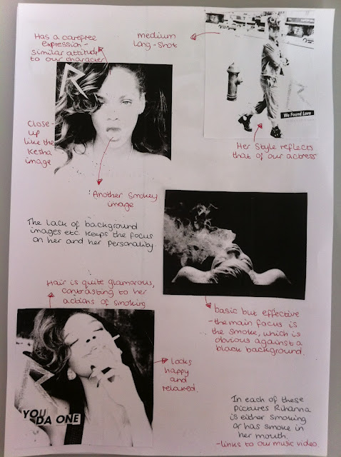
My group and I researched artists such as Rhianna, Kesha, Ellie Goulding and even Katy Perry. We choose these four artists as they are all extremely sucessful, yet unique female solo artists. They are unique through either the way in which they dress, perform and the music that they produce. In a lot of their videos they create crazy and wild vibes as if they are totally off the rails, this is the sort of theme my group and I want to create for our music video.


The theme for Rhianna's digi pack, I feel it is rebel like as she is portraying sexual themes and smoking or exhaling smoking it almost every photograph.


Friday, 9 March 2012

Magazine Research

The song featured in our music video 'Ignorance' by Paramore is the song and album on the poster featured below. It is an Indie Rock band consisting of four males and one female. The poster below features the band Paramore promoting their new album and the song 'Ignorance'.


Our magazine advert for our artist 'Elle' is planned to be more clean cut and feminine than the poster above. But my team and I still aim to portray a rebellious image of our featured actress 'Ellie Blancke'. We aim to do this by making the background of the poster a cool, crisp colour potentially a light blue. Ellie will be dressed quite glamorously but will pose with attitude to straight away kick off the theme of the music video and the story behind the song.....a messy break up.